Author: Emmaly Nguyen

  • The Devil Wears Science: My Experience!

    The Devil Wears Science: My Experience!

    Since it was my first semester in the StemCOMM VIP, I was a little nervous to be taking part in organizing a Fashion Show for the 2023 Science Festival. Luckily, I met some great people who were helpful and encouraging the whole process through.

    In the beginning, I was on the team that would cover the Additive Armor section of the show, but I started to become more involved with the Sustainable Team. We worked with the Kendeda Sustainability Fellows to compile research regarding textiles, fast fashion, and the clothing life cycle. Below is some of the information we found through research!

    Fast fashion is the quick production of low-cost clothing, that is often trendy and not built to last. We wanted to talk about how the production, sale and eventual disposal of fast fashion items has a significant impact on our environment, and our communities. Many of the materials used to make our clothes have a heavy impact on the environment. For instance, it takes 2,700 liters of water to produce a single cotton t-shirt. Every year, the dyeing of fabrics consumes about 5 trillion liters of water. These chemicals used to clean and dye the clothes are often washed out into natural sources of water, causing harm to local ecosystems. It takes a lot of resources to get a piece of clothing to a consumer. But what happens when the trend is over and fast fashion is no longer fashionable? The average American throws away 81 pounds of clothing each year. The EPA estimates that only 15% of unwanted clothing is recycled. What can we do? The most sustainable thing we can do is use what we already have. We can do this by reusing and upcycling unwanted clothes. By breathing life into garments that have already been made, we can reduce the demand for new clothing production and break the cycle of wasteful fashion practices. 

    We met multiple times before the show to flesh out who was speaking, who would model, etc. We also visited the Kendeda Revolving Closet, where anyone can drop off clothes and shoes for donation! The closet is an initiative located in the basement for community members to donate their unwanted clothes for other to community members to use again. People are also welcome to take from the closet at no cost! When I visited the Closet, I was surprised by some of the clothes there. We were able to find some outfits for the fashion show. With three sustainable outfits planned out, we also needed 3 models. The models ended up being VIP members, and a Kendeda Fellow was our speaker/presenter. We ended up merging this section with the Additive Armor section, so we included a fourth model to wear the dress.

    I also worked on creating a pamphlet/event program for guests to look through and learn more about each exhibit.
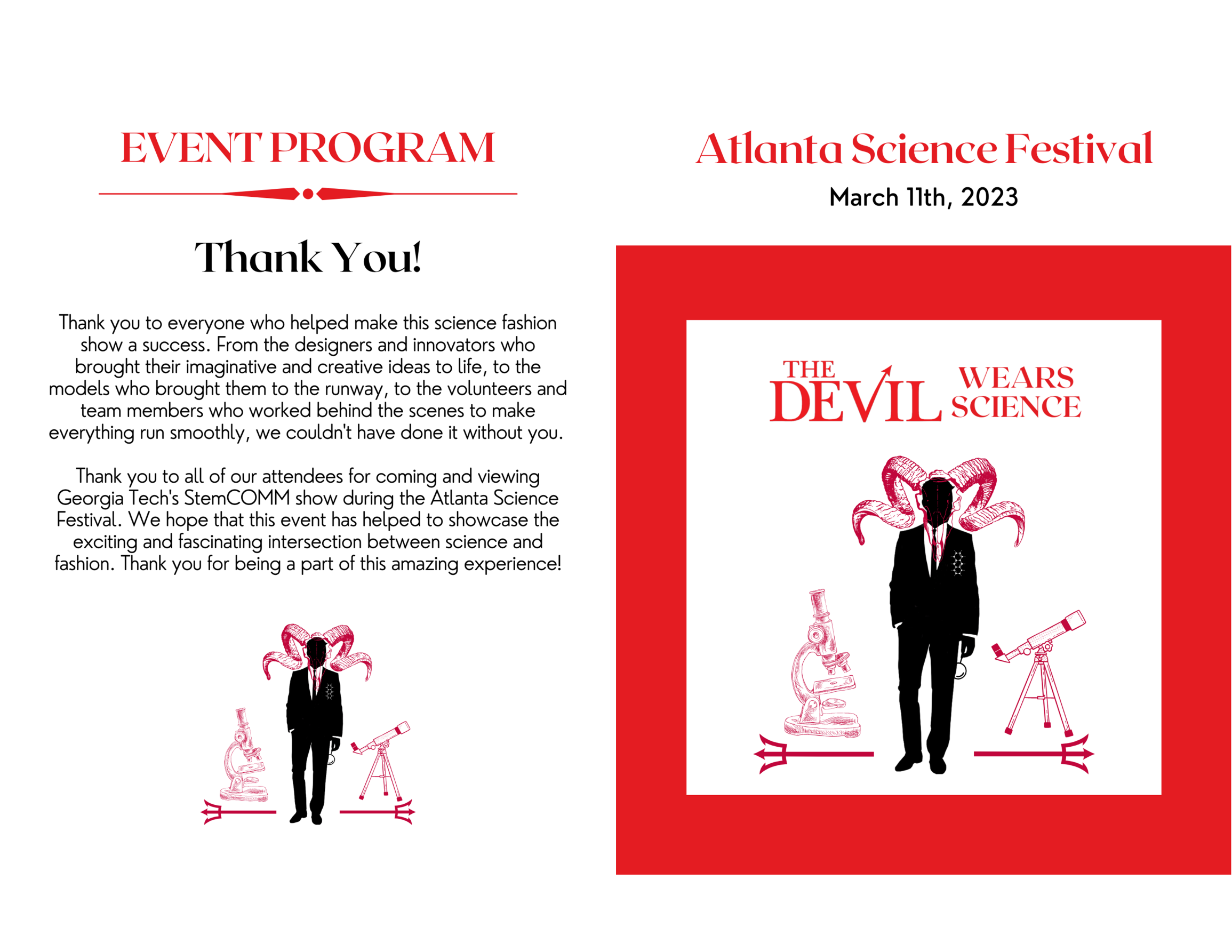
    Devil Wears Science Program

    On the day of the event, things were starting to come together and time was moving fast. Steven and I went to print out QR codes that would link to the event program, as well as print out physical copies to staple together. Before the show started, all of us changed into our model outfits and got ready to strut the runway.

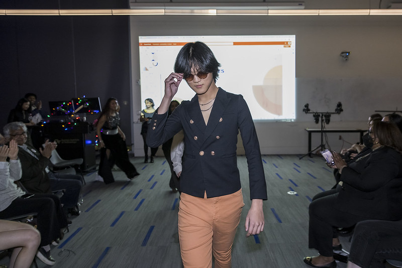
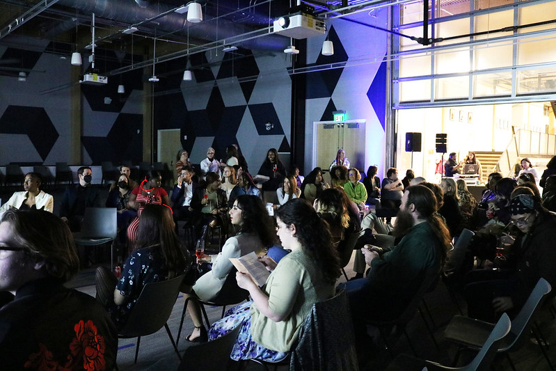
    The show was a success! Here are some photos from the event:
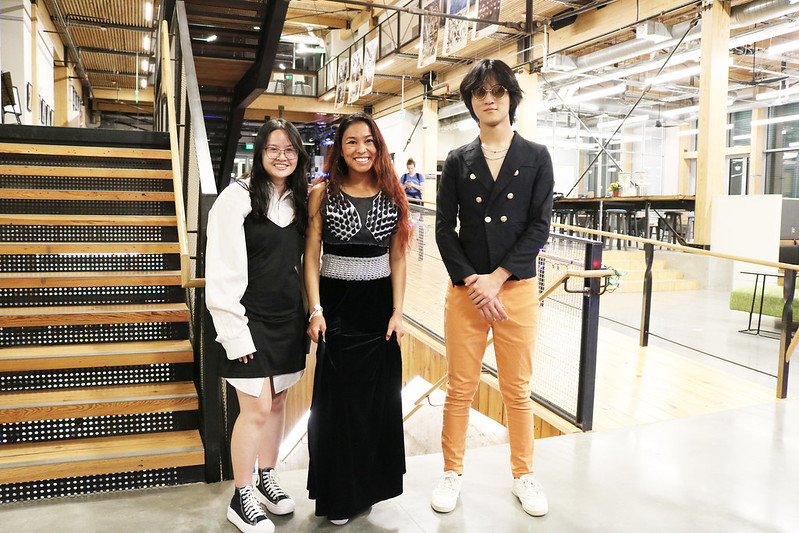
    Sustainability Models
    Steven Yang Model
  • AI, Font Pairing, and Font Psychology

    AI, Font Pairing, and Font Psychology

    To me, choosing what font to use is the most fun part of a design process. However, it’s almost sometimes the most difficult. Your choice of typography sets the tone of the app and matters as much as the rest of interface layout. In most cases, when I’m designing an app or web interface, I’ll decide to use two fonts, one for titles and headers, and one for text. I’ll then find myself scrolling for hours trying to decide which fonts go together, whether I should use sans-serif fonts and no serif-fonts, etc. Once I heard there was a way to use Artificial Intelligence (AI) to pair fonts for me, I could only imagine the time I would save. Before we dive into the AI method, let’s go over some font basics. 

    There’s many different types of fonts: serif, sans-serif, script, decorative, and monospace. These are commonly found categories when you’re looking at a font library.

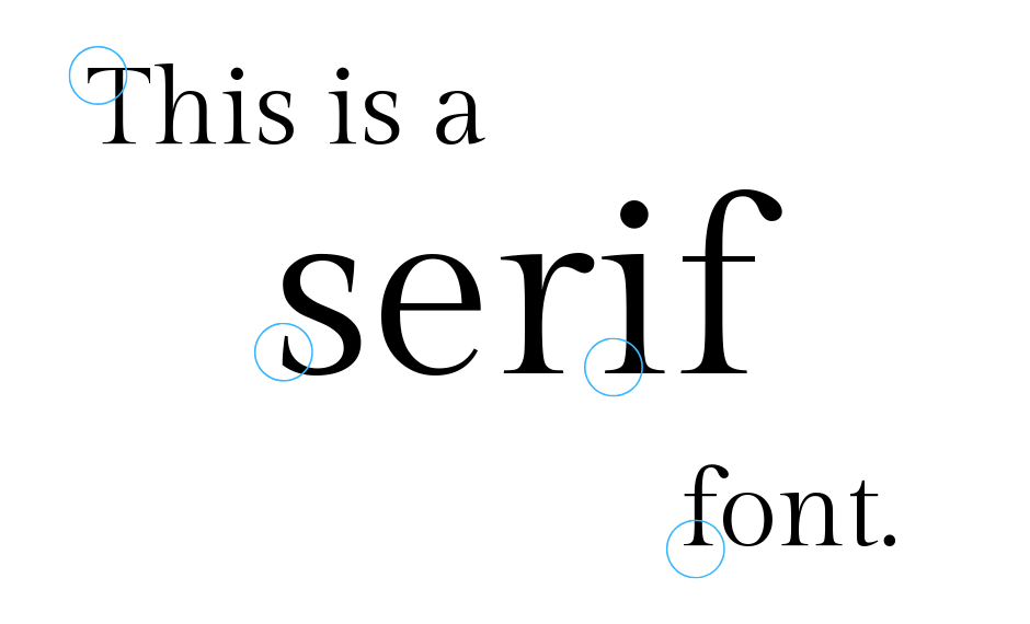
    Serif

    Serif fonts have strokes on the end of each character. It makes the font look ~fancy~ 

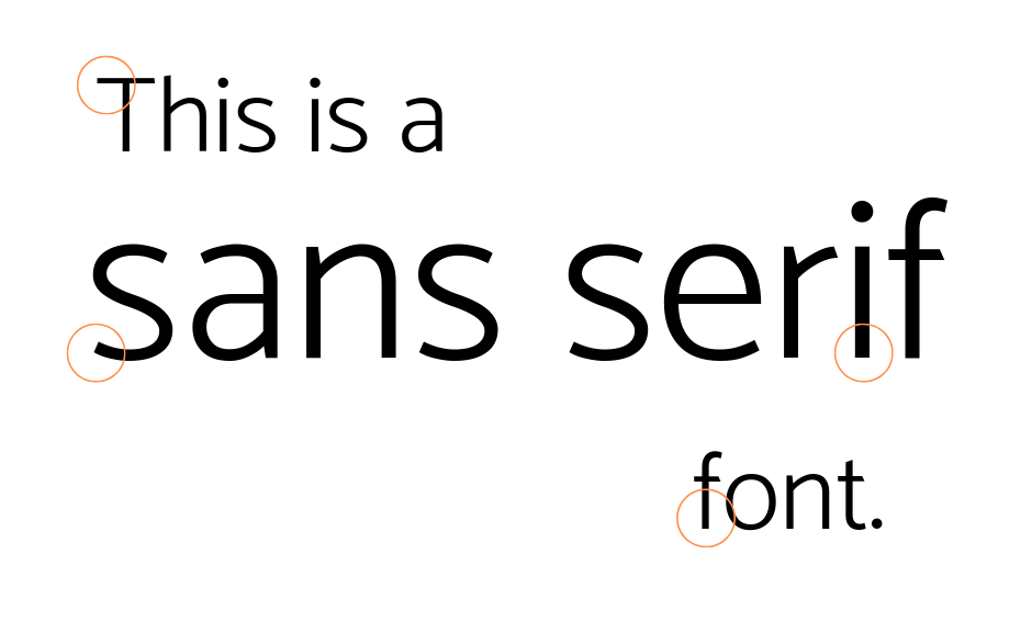
    Sans-Serif

    Sans-serif fonts don’t have extra strokes on the end. These usually provide the most legible reading experience for users. 


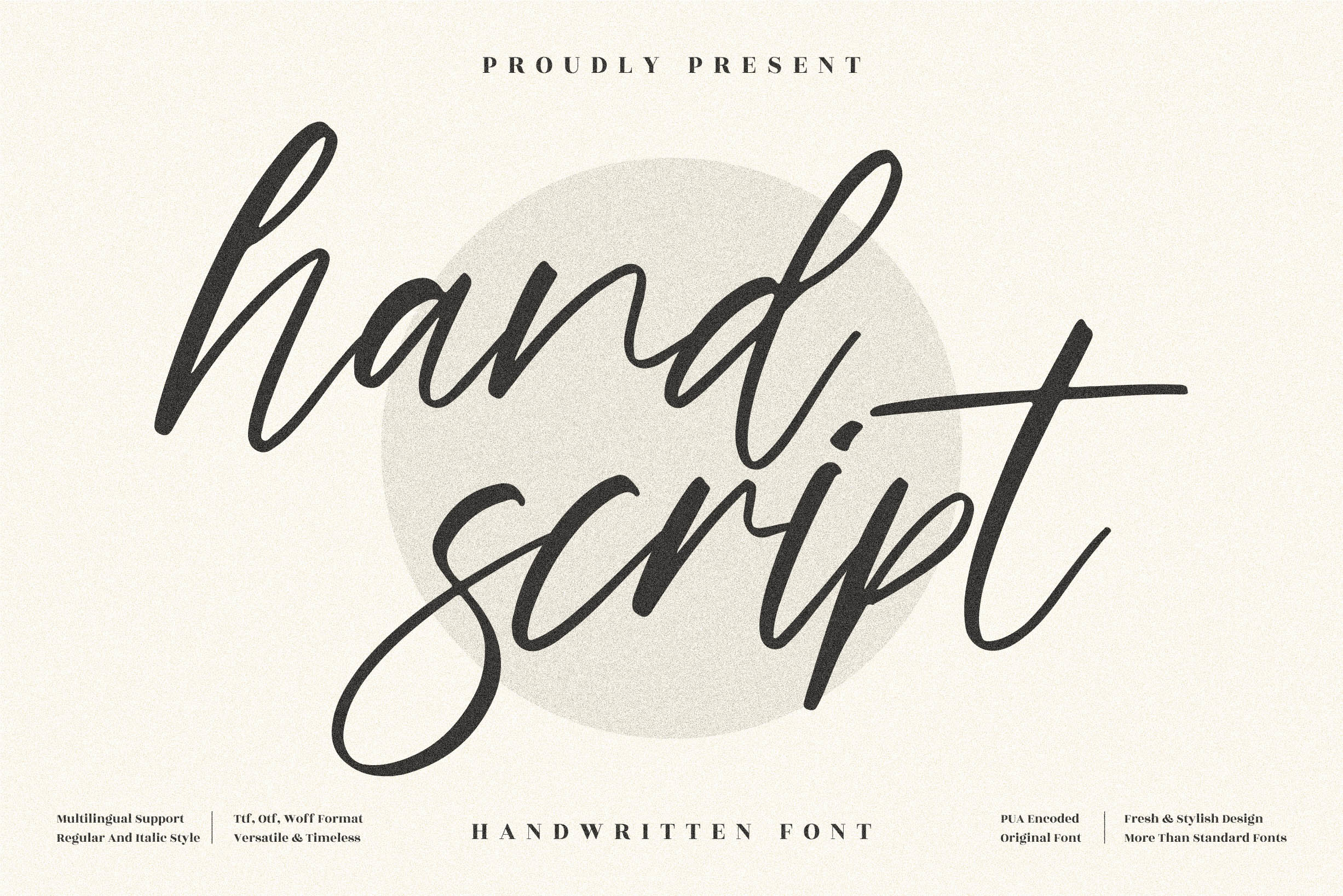
    Script

    Script fonts are in a more handwritten style  that includes varied and fluid strokes.

    Decorative

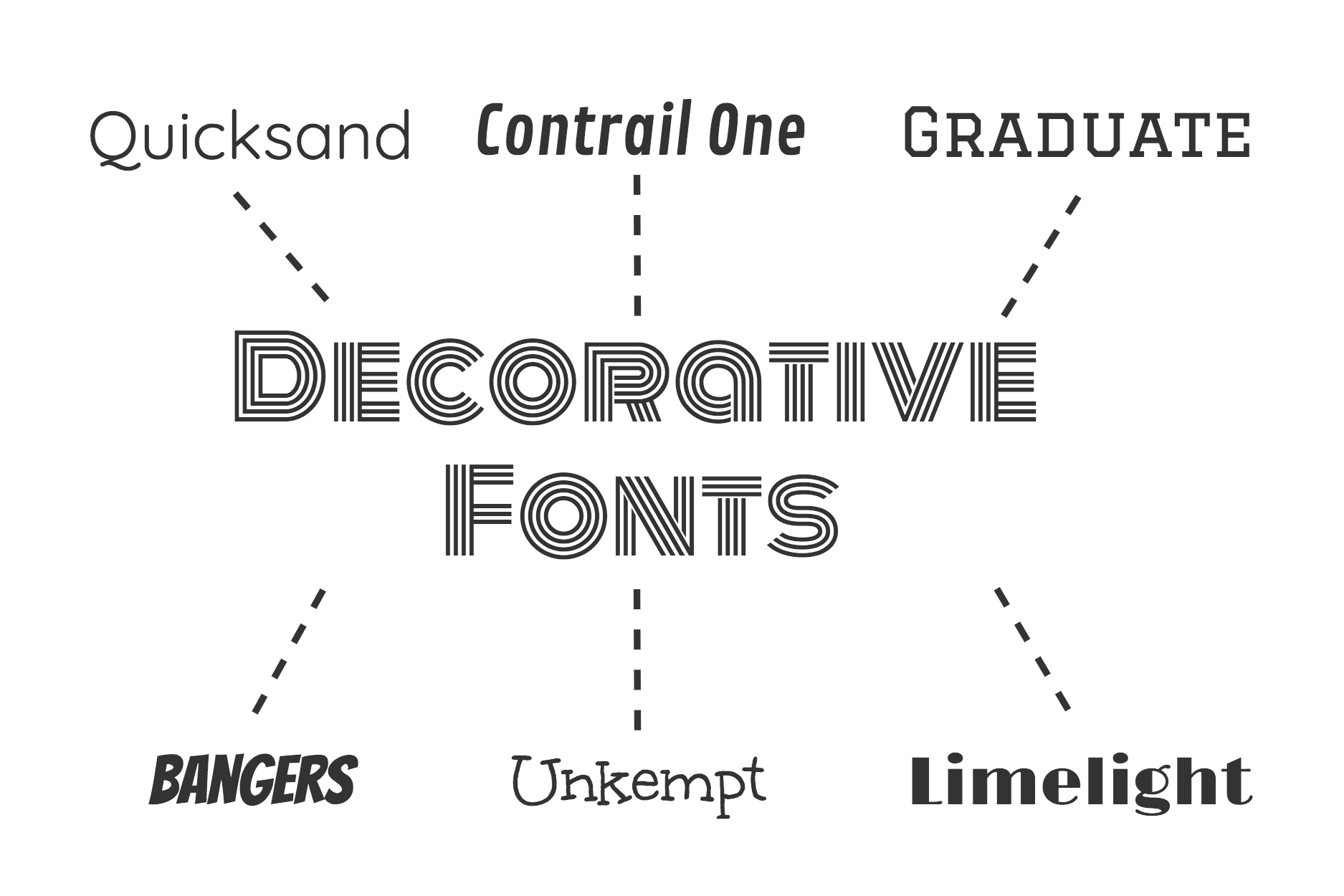
    Decorative fonts have the biggest personalities. They have unique looks and are used to grab the users’ attention. They’re much more dramatic and have distinct letter shapes. 

    Monospace

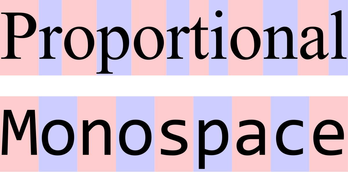
    Like the picture says, Monospace fonts have characters that are the same width/each character takes up the same amount of space horizontally. This font gives your designs a very simplistic and computer-y vibe. 

    As you can see, we have all these different types of fonts, and each of these has subcategories of fonts. You might wonder, how do I know which font to use with which? How do I know what looks good with what? That’s where AI can help! There are programs like FontJoy and Monotype that use machine learning to choose font pairs that look the best together. Some parameters AI can take into account to pair are the weight of the font, the obliqueness of the font, the style, and so on and so forth. Monotype also compares the levels of harmony and contrast between fonts. 

    You might be wondering: Why do we care about font pairing or how fonts look?  

    When it comes to visual design, font psychology has to be accounted for. Font psychology is the visual and emotional reaction you have to the font you’re seeing, according to 99 Designs. According to Albert Mehrabian’s Rule of Personal Communication, 93% of personal connection is non-verbal, meaning ideas and values need to get across in the simplest way possible. Because people will only take a couple of seconds at a design, there is a short chance to capture their attention with font. We can look at the Kolenda Font Model to evaluate how we perceive fonts and what we associate with them. There is also shape and color psychology. Certain geometric forms elicit certain emotions or feelings for the viewer, as do colors. If a font is rounder, it makes the viewer feel more bubble, relaxed, and fun, whereas a sharper more rigid font elicits a  more professional and serious tone. 

    Next time you’re using a font for a design, pay close attention to the style, shape, and color if you’re trying to convey a certain message!